Another leftist statist myth busted

The other myth punctured: Sinking under Reagan, growing under Obama.
ETA: I doubt that this is the final word on the debate.

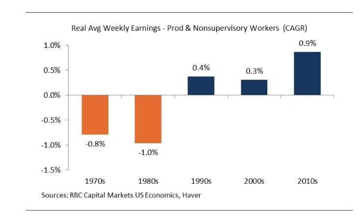
Let's say I make $1,000 a week in 1970.
By 1980, RBC Capital Markets is telling me that I will 'suffer' a CAGR of -.8% in my weekly wage and now make $923 a week. By 1990 I suffer another -1% and I'm down to $835. Then by 2000 I grow .4% to $869 and by 2010 to $895 then finally by 2020 I'm making $979 per week
Does this infographic show what you think it does?
This graph is: purposely confusing, possibly not based on real data, and apparently not useful for extrapolating into the future or making value judgements on past earnings.
This chart is inflation adjusted. It is the real (after inflation) change.


It'd be nice if the linked story provided more detailed data. Looks like that chart is it, though, which makes it difficult to evaluate what the data really says. A few questions I have:
- why are we aggregating by decade? Ten years is a long time. I can't tell from this chart, for instance, if the "2000s" category being lower actually says something useful, or if that's all a result of the 2008 crisis.
- For that matter, why bar graphs? A line graph seems like the more obvious choice for this kind of data. I can't really see fluctuations, trends, etc in any kind of useful detail at all from this graph
- The article text notes that even though wages seem to be rising, inflation appears flat, which is surprising. One possible explanation might be that wages have been far under what they "should" be, and that this rise (how much? how recent? Who knows - it's al bucketed under "2010s') isn't causing inflation because they're simply making up for the "decades of stagnation." Is this a reasonable explanation? Impossible to say based on the coarse level of detail provided in the text and graphic.
Probably a lot more questions that would come to mind with a minute or two more of thought. I don't really plan on doing much arguing on this thread -- there's barely any information here to argue over.
ETA - It'd also be great to see the 50s and 60s there - and, again, as a line graph rather than the pretty useless bar graph bucketed by decade.

at least Zoinks now sees that our country was modestly better off under Clinton and Obama than Reagan, Bush and Bush.

It seems to me that almost anyone with a modicum of know-how and access to a search engine can come up with "proof" that their view on anything is the correct view........

my rule of thumb is that when the visual depiction of data doesn't tell an obvious and clear story, it's probably been purposely designed to be misleading. And that chart is not at all obvious or clear.

It's heartwarming to see you guys continuing to futilely engage strawberry.

ina said:
It's heartwarming to see you guys continuing to futilely engage strawberry.
bramzzoinks isn't strawberry.


where exactly is this low inflation everyone talks about? In the flat screen tv market?

For Sale


Free Items

Employment Wanted
Latest Jobs
Employment Wanted
-
On call house cleaning service
May 6, 2024 at 7:17pm
-
May 6, 2024 at 10:11am
-
Experienced Summer Nanny Available: Thursdays & Fridays ;)
May 6, 2024 at 8:56am
-
Brazilian cleaning 973 776 2481
May 5, 2024 at 7:35pm
-
May 5, 2024 at 11:14am
-
May 4, 2024 at 1:08pm
Help Wanted
-
May 7, 2024 at 7:32am
-
May 3, 2024 at 2:32pm
-
Cat Lovers - become part of our lovely Silver Hound Cat Sitter team
May 3, 2024 at 2:12pm
-
PT Driving mother’s Helper needed
May 1, 2024 at 10:31am
Lessons/Instruction

Advertisement


Stagnant wages? Maybe it is just an illusion because of low inflation and middle class jobs are seeing the largest real (inflation adjusted) gains in 50 years.
http://www.bloomberg.com/news/articles/2016-06-03/u-s-wage-growth-is-on-pace-to-break-records-this-decade